Monday, 10 November 2014
Audience survey analysis:
Here is a powerpoint where I analysed each of the 9 questions that I placed in my audience survey, I had a look at my feedback and I used it to expand on the magazine ideas.
Sunday, 9 November 2014
Thursday, 6 November 2014
Monday, 3 November 2014
Audience survey:
Create your free online surveys with SurveyMonkey , the world's leading questionnaire tool.
Sunday, 2 November 2014
Tuesday, 14 October 2014
Production log 8:
I have just finished my analysis of my 3 music magazine contents pages and i have just uploaded them on to my blog. I included load of detail in each of the 3 analysis which consequently means i think it went really well
The next 2 tasks are the analysis of my 3 music magazine articles and codes and conventions - I will be completing my codes and conventions on Prezi
Below is a picture of my analysis of my 3 music magazines contents pages on my blog: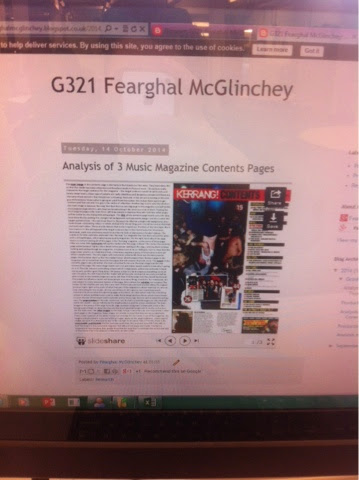
Thursday, 2 October 2014
Production Log 7
I have just completed the aim I set myself which was to finish all 3 analysis' of the 3 magazine front covers. I litterally just uploaded them onto my blog aswell so if you would like to look through it, you can do so. Every one of the 3 slides I have done is full, I included as much detail as I could and I hope that comes across when people read it. For each of the 3, I talk about the masthead, the main image, whether it has extra links placed on the cover e.g. website name, the sell lines and finally the target audience.
Here is pictures of my work:


Production Log 6
In yesterday's AS Media lesson on 1/10/14, I started to the task of analysing 3 music magazine front covers. The 3 magazines I have chosen are "NME", "Billboard" and "VIBE", I chose these magazines because I feel they were the best ones due to having the most to say about them.
I aim to complete all 3 analyis' at home.
Here is a picture of me starting my analysis:

Wednesday, 24 September 2014


Monday, 22 September 2014
Preliminary Task Draft


At the very start, after I thought of all my ideas, I came up with the sketch for my front cover and contents page to give me a general idea of what i wanted. A few things have been changed looking at my finished 2, i did this due to it looking more appealing. I used InDesign to create my magazine.
Preliminary Tasks Ideas
This powerpoint presentation shows what all my ideas were before I started to sketch everything down, showing all of the potentional other things the magazine could of had. It also shows all of the pictures I took, some I included in the magazine, some I didn't.
Evaluation
For this task I am going to evaluate my front cover and contents
page of my school magazine ‘The Days of Haydon’. I created my magazine on
InDesign which I have never used before the start of this task.
 For my front cover, I chose a mid-close up shot of a new sixth
form student smiling at the camera. I chose a new sixth form pupil because I
wanted to get the new students involved within the school community. I also got
the student to smile because it gives off a positive vibe to the customers who
buy/see the magazine, if the student was not smiling, it would give off the
effect of a quite boring and dull magazine. Also, the smart clothing that she
was wearing shows people it is a high quality school, if she was wearing her
own clothes it would show people that Haydon is a much laid back school, but
that isn’t the case so I wanted to show that. Formal characteristics is key;
which is why I didn’t fill the page with writing and pictures. I wanted a very
simple look but this type of style would still attract many customers. The font
that I used for the title, ‘The Days of Haydon’, was Eras Bold ITC, I made
the title have a bold outline by choosing 2 colours which are different, white
and grey, and these colours stand out when with each other. I have put white as
the main colour and grey as the outline colour to make it stand out. In the
bottom left hand corner of the page I put the title of the 2 main pages in this
week’s edition of the magazine to draw in my audience as the 2 main pages are
meant to encourage people to purchase the magazine so they can read it.
For my front cover, I chose a mid-close up shot of a new sixth
form student smiling at the camera. I chose a new sixth form pupil because I
wanted to get the new students involved within the school community. I also got
the student to smile because it gives off a positive vibe to the customers who
buy/see the magazine, if the student was not smiling, it would give off the
effect of a quite boring and dull magazine. Also, the smart clothing that she
was wearing shows people it is a high quality school, if she was wearing her
own clothes it would show people that Haydon is a much laid back school, but
that isn’t the case so I wanted to show that. Formal characteristics is key;
which is why I didn’t fill the page with writing and pictures. I wanted a very
simple look but this type of style would still attract many customers. The font
that I used for the title, ‘The Days of Haydon’, was Eras Bold ITC, I made
the title have a bold outline by choosing 2 colours which are different, white
and grey, and these colours stand out when with each other. I have put white as
the main colour and grey as the outline colour to make it stand out. In the
bottom left hand corner of the page I put the title of the 2 main pages in this
week’s edition of the magazine to draw in my audience as the 2 main pages are
meant to encourage people to purchase the magazine so they can read it.
Moreover, I have faded the Haydon logo into the main picture
which certainly makes the front page look more appealing, it also
makes it clear that the magazine is a Haydon school one and to show that it is
a proud one. I faded it out at 45%.
 Moving on to my contents page. The
contents page is similar to the front page as it has a similar colour scheme,
for example, the title for the front page and the title for the contents are
the exact same, the only difference being they say different things. The
writing on the contents page is also the same colours and font it’s just that
writing is much smaller and the outline of the writing is darker. Keeping the
same colour schemes throughout the 2 pages is a good way of keeping it simple.
As I said, keeping it simple is a very formal characteristic; Haydon School is
thought of very highly in the local community, if I had made an informal contents
page Haydon’s reputation would drop as it would look quite childish. My main
picture for my contents page is the big main tower near the sixth form centre
in the school. This is a very well-known part of the school meaning people will
easily recognise it, as they are familiar with the picture it will make them
feel more attached to the magazine as they pass the tower every day of their
school life. However, I have faded out the main picture to 50% because then the
writing on the page stands out much more clearly and that’s what the contents
page job is, to tell people what is in the magazine. At the bottom of the page I
have put 4 pictures to give the page a better visual effect and I have also
faded these pictures out but this time to 65%; I have done this again to make
the writing the main part of the page. I have placed the 4 pictures in an organised
fashion to keep the page formal. I also curved the pictures a little bit just
to make them more interesting as every other picture is in a square form.
Moving on to my contents page. The
contents page is similar to the front page as it has a similar colour scheme,
for example, the title for the front page and the title for the contents are
the exact same, the only difference being they say different things. The
writing on the contents page is also the same colours and font it’s just that
writing is much smaller and the outline of the writing is darker. Keeping the
same colour schemes throughout the 2 pages is a good way of keeping it simple.
As I said, keeping it simple is a very formal characteristic; Haydon School is
thought of very highly in the local community, if I had made an informal contents
page Haydon’s reputation would drop as it would look quite childish. My main
picture for my contents page is the big main tower near the sixth form centre
in the school. This is a very well-known part of the school meaning people will
easily recognise it, as they are familiar with the picture it will make them
feel more attached to the magazine as they pass the tower every day of their
school life. However, I have faded out the main picture to 50% because then the
writing on the page stands out much more clearly and that’s what the contents
page job is, to tell people what is in the magazine. At the bottom of the page I
have put 4 pictures to give the page a better visual effect and I have also
faded these pictures out but this time to 65%; I have done this again to make
the writing the main part of the page. I have placed the 4 pictures in an organised
fashion to keep the page formal. I also curved the pictures a little bit just
to make them more interesting as every other picture is in a square form.
My design sketches and my finished
magazine are not the same. On the front page, the things that I have
changed/added is the font of the title and also placing the faded Haydon logo
on the page. I changed the font because my first idea for the font was a very
thin type of font meaning it would not stand out at all. I added the Haydon
logo in to the magazine to make it appeal to my audience much more. On my
contents page the things that I have changed/added is also the font again,
adding a background picture and the amount of the pictures at the bottom of the
page and in what type of manner I placed them in. Changing the font was the same
reason to changing it on the front page. Adding a background picture is what
draws the reader in, if there was no background picture the page would look
really plain and would attract very few people. Even though the picture is
faded out, it still has a massive effect to drawing in the audience because it
is the main tower. I have already stated the significance of the tower. I reduced
the amount of pictures because filling the page with pictures would make it
unprofessional. I have already stated to why I have placed the pictures how I have.
Things that I thought went well was
the fading out of the Haydon logo on my front page as it made the page much
more interesting to look at as it was a unique feature that my audience have
never seen before. I also thought that the curving of the pictures in the
contents page is another thing that went well because that was also unique and
it makes a change from the dull square photos that everyone sees on a daily
basis.
If I was to do my front page again, I would
put the student next to a popular area in the school, for example the study
room, this would attract more of the students. If I was to do my contents page
again I would make my title stand out more by maybe making it a little bigger.
Wednesday, 17 September 2014
Production Log 5
In today's lesson on 17/09/2014 I was able to complete my target that I set myself from last lesson which was to fully complete my contents page. I added 4 photos to the bottom of the page which I took in previous lessons, I made these photos rounded and faded them out a little to give it effect.
I also was able to start a little slideshow where I have put all my ideas which I had at the start before I began anything at all.
As my magazine is finished I will need to complete an evaluation on it before my next lesson.
I also was able to start a little slideshow where I have put all my ideas which I had at the start before I began anything at all.
As my magazine is finished I will need to complete an evaluation on it before my next lesson.
Tuesday, 16 September 2014
Production Log 4
In my AS Media lesson on 15/09/2014, i completed the target that i had set myself from last lesson; the target was to get 3/4 of my contents page done.
On the contents page i have one main big picture, similar to the front page, but this time i have faded out the main picture because the main bit on the contents page is the writing telling people whats in the magazine, the faded picture makes the writing stand out much more.
I have put an outline on the writing to give it just that little more effect, consequently making it stand out more.
To finish my contents page i am going to be putting various pictures at the bottom of the page, to give the page a good visual aspect. That will be my target for next lesson.
Here is a picture of my current contents page:

Production Log 3
In my lesson on 10/09/2014, i continued with my 'The Days Of Haydon' magazine. My targets that i set myself from last lesson were to finish the front page and get a good amount of the contents page complete. I have completed one out of two of these tasks - by finishing the front page.
My front page is very simple, but i believe the more complicated the page, the less people would want to look at it/read it. The only picture I have got is one big main one and thats all. The simple set up is an attraction to all ages. I have also put the Haydon logo over the top of the picture but i have faded it out to give the cover a very modern look.
My target for next lesson is to complete 3/4 of my contents page
Here is a picture of my front page:

Sunday, 14 September 2014
Production Log 2
In the AS Media lesson I had on 08/09/2014, i started to make good progression on my 'The Days Of Haydon' magazine. As soon as the lesson started, i partnered up with a friend and then we both went out to take pictures for our magazine - we have to include a mid close up in our magazines so we took pictures of each other. As we were walking around we also asked other Haydon students for their permission to take a picture of them for the magazine, most of them said yes, this adds much more variety.
We then went back to the classroom and transferred our pictures on to our computers so that they were then easily accessible. For my magazine, I planned to have a mid close up covering the whole of the front page - I followed through with this. After I inserted my picture, I then decided to do the title next. I was able to write out my title but I didn't have enough to chose an appropriate font as the lesson ended.
For next lesson my targets are to finish the front page and to get a good amount of my contents page done.
Wednesday, 3 September 2014
Production Log 1
In my first AS lesson for Media on 03/09/2014, I was set the task of having to complete a basic sketch of a front cover of a magazine about the school I attend (Haydon) and also a contents page. On the front cover you had to include a mid close-up of a pupil at the school. I called my magazine "The days of Haydon". On my contents page I included pages such as 'Welcome to the new year 7s' 'Well done to the year 13s' etc.
Subscribe to:
Posts (Atom)